
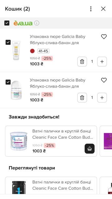
Before
In closed testing; an A/B test comes next
The problem
The cart was the narrowest point of the funnel: many people opened it and never reached the checkout. Promotions came without explanation, items from different sellers came without structure, and there was nothing about delivery. Under it, the cart reloaded its whole state on every change, lagged on phones and broke when reopened.
What changed
-
Each seller is its own order
Groups say “Order N of N”, the header sticks while you scroll, and EVA’s logo is set apart from the partners’.
You see at once which items are EVA’s and which a partner’s.
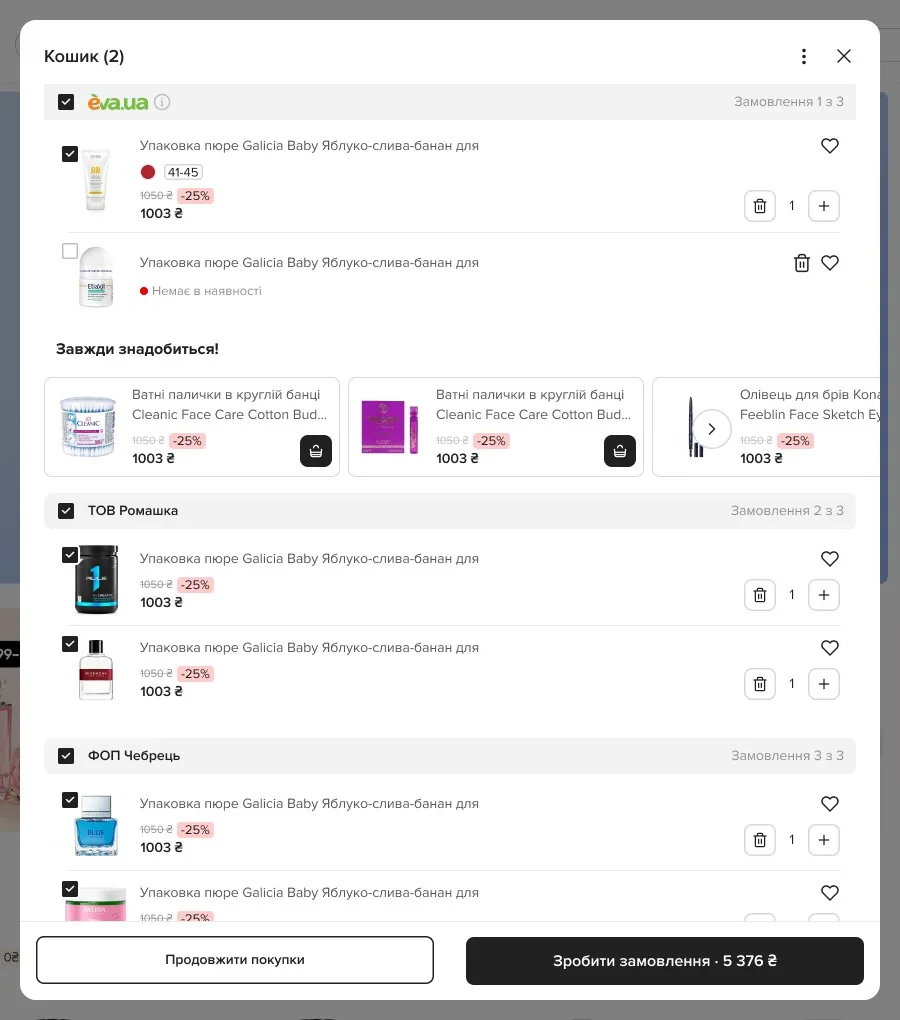
Three sellers, three orders: “1 of 3”, “2 of 3”, “3 of 3” -
Choose what to buy
Checkboxes for items and sellers, select all or none; the sum counts only what is chosen.
A checkbox on the seller and on every item 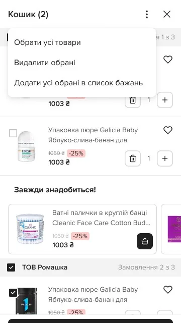
The menu acts on what is selected -
Free delivery, shown as a distance
A progress bar to the free threshold of the chosen method (pickup point, Nova Poshta, Ukrposhta); it remembers your last choice and suggests items to add.
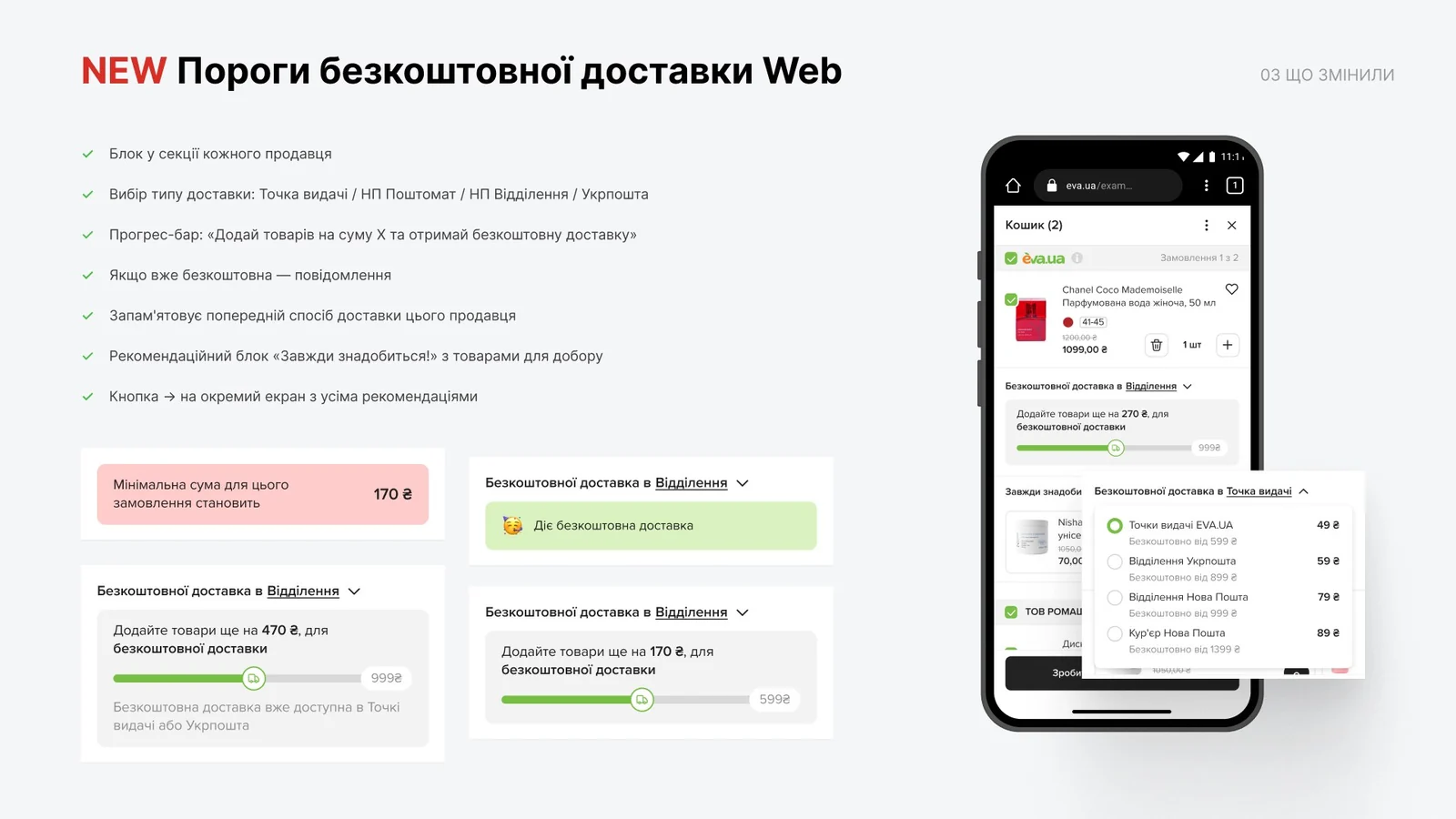
The thresholds, from the design file: method, bar, message -
Bundles without repeats
A promo set is its own subgroup; its prompt opens a picker; no item shows twice.
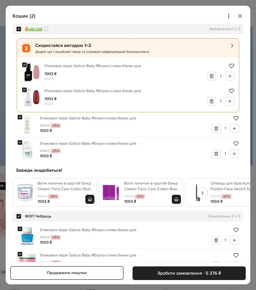
1. One item short: the prompt says what to add 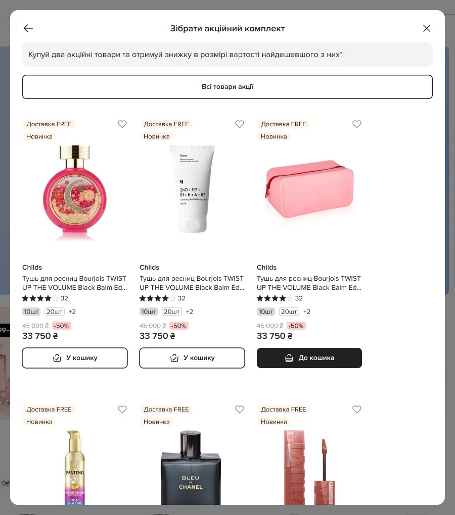
2. The prompt opens the picker 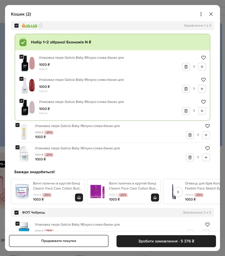
3. Set complete, the saving named -
Out of stock is not a dead end
The line greys out, and “Replace with a similar one” opens matching products.
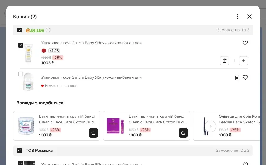
The item greys out and stays in its place -
The cart’s own controls
“Cart (N)” in the title, a “⋯” menu to remove or clear, and a sticky order button with the total.
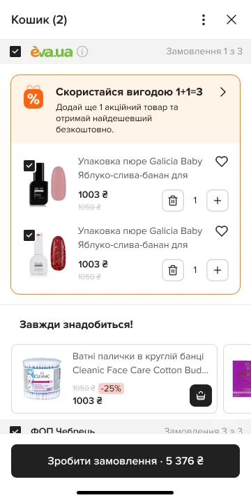
“Cart (2)”, the ⋯ menu, the order button with the total
Where it stands
- Closed testing now
- Then an A/B test of the seller groups and the delivery bar against today’s cart.