

Before the bottom menu
+3.1%visit to purchase
The problem
On mobile, navigation lived only in the header. To get from a long listing or a product page to the catalogue, the cart or the promotions, you scrolled back up or went back.
On desktop, people did not see where to go in the catalogue and went to search instead.
What changed
-
A bottom menu on every page
Home, Catalogue, Promotions, Cart and More stay fixed at the bottom of every page, in thumb reach. A later step, with the new checkout, moved the cart and wishlist actions into it.
Every extra step back to the header cost visits and purchases.
Before: mid-page, the only way on is back up After: the menu stays under the thumb on every screen -
The whole catalogue, open on the home page
On desktop the category list stays open on the left of the home page. Hovering a category opens all its subcategories, two levels down, in columns.
The customer sees how the shop is built without a click, and reaches the shelf in one or two clicks instead of page by page.
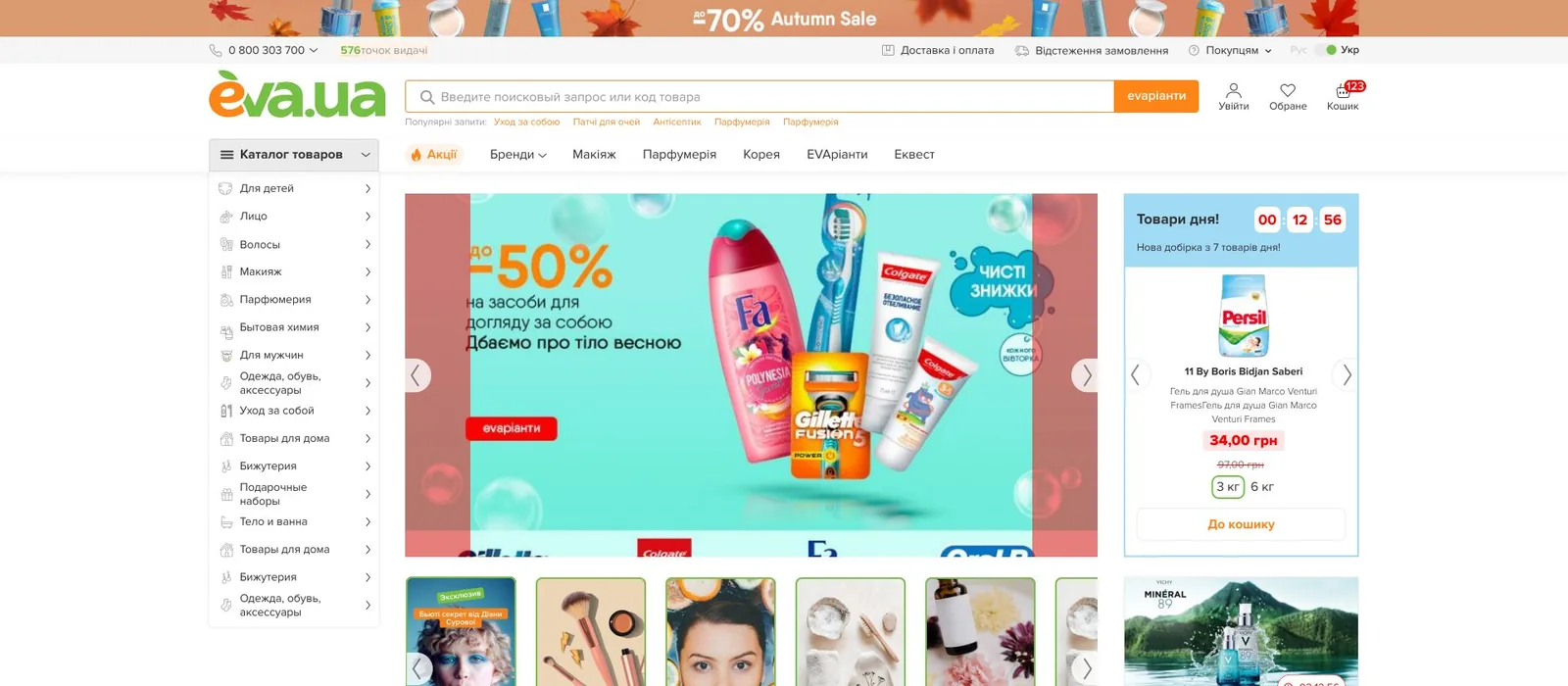
Before: a narrow list, one level at a time 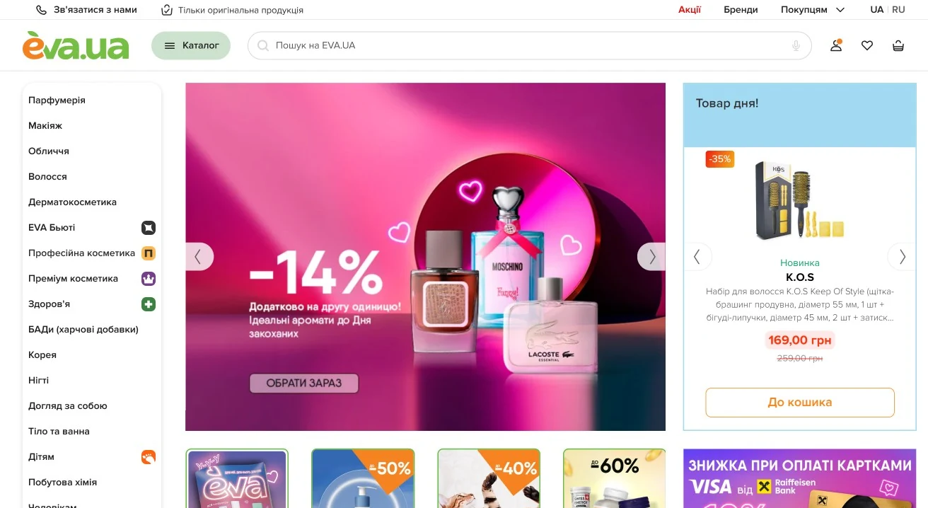
After: the catalogue open on the home page -
Ways in that match how people shop
Each category opens with New, Only on EVA.UA, Brands, Best sellers and Promotions. Beauty, professional and premium cosmetics, health and kids get their own icons in the long list. Search suggests categories and brands, not only products.
Search leads back into the catalogue, so a search is not a dead end.
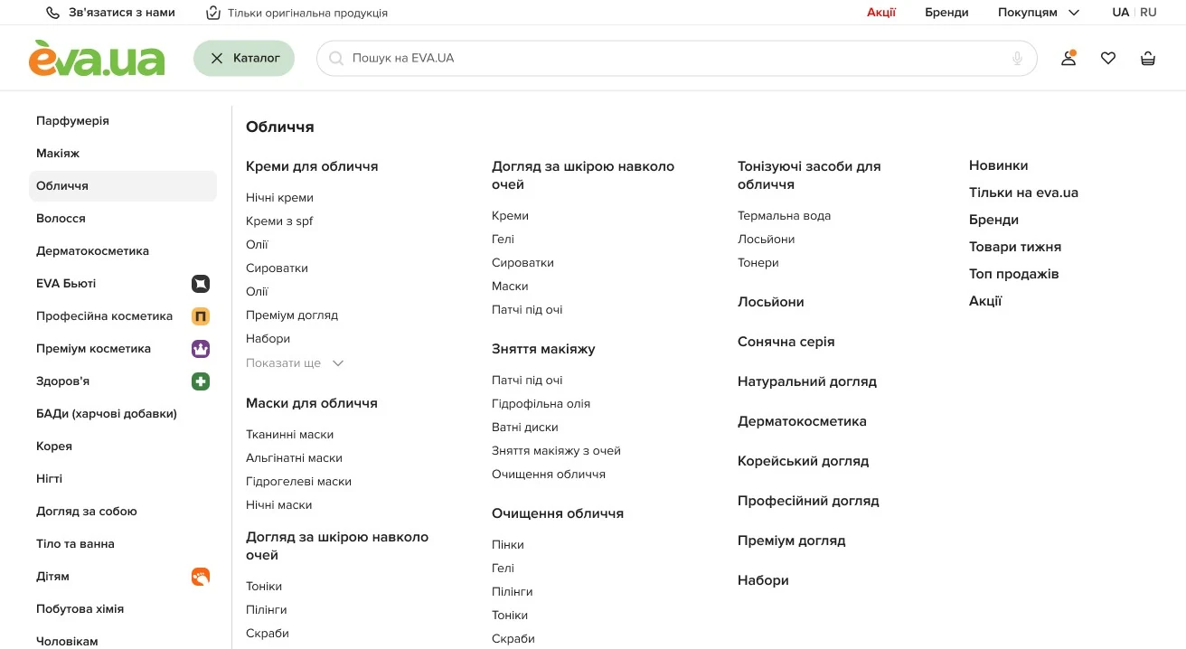
A category hovered: two levels, in columns 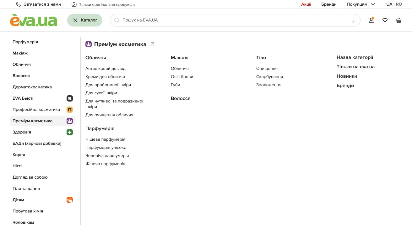
Premium cosmetics, with its own entry and icon 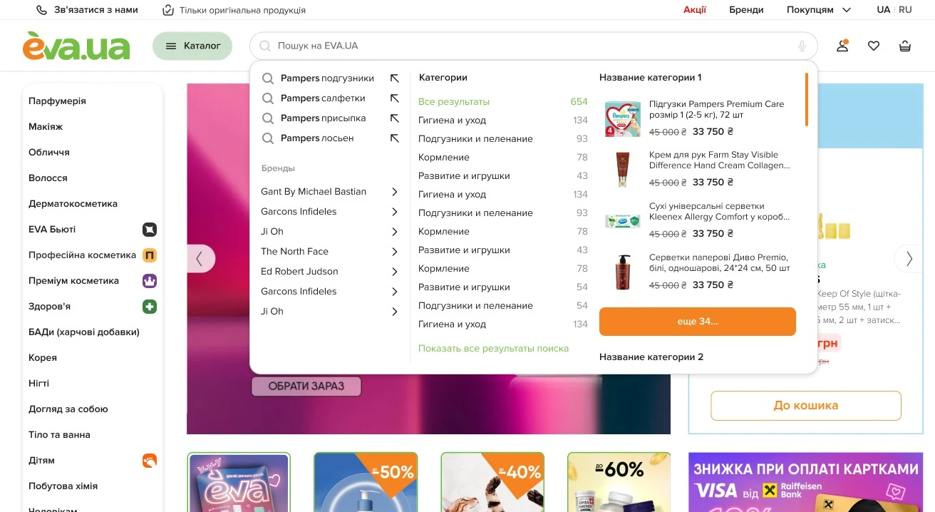
Search suggests categories and brands -
The same catalogue on the phone
A Catalogue button on the home page, a full-screen catalogue with the directions’ icons, subcategories one step at a time, and promotions, brands, pickup points and the account in the menu.

The Catalogue button on the home page 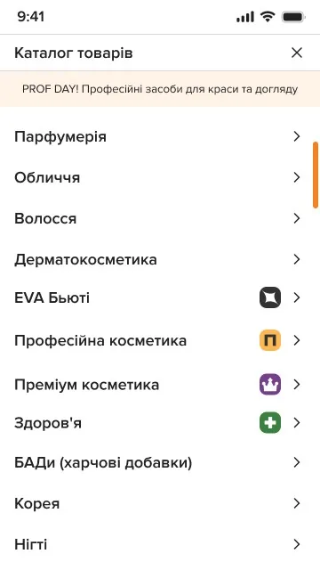
The full-screen catalogue 
One step in 
Promotions, brands and pickup points in the menu
How it was proved
The bottom menu
- Time on site, every page but home
- From about 2–3 to about 5 minutes
- Checkout to purchase
- +2.3%
- Visit to purchase
- +3.1%
- Menu 3.0
- People go deeper into categories, use search less and stay longer.
- No before-and-after figures: the release came before the dashboard could split sessions by search.